Logowork
Logo iterations for up-and-coming videogame streamer on Twitch.
The process
We will be going through my entire process of working on the logo for an up-and-coming video game streamer on Twitch.
Check out his Twitch channel by clicking on his name below!
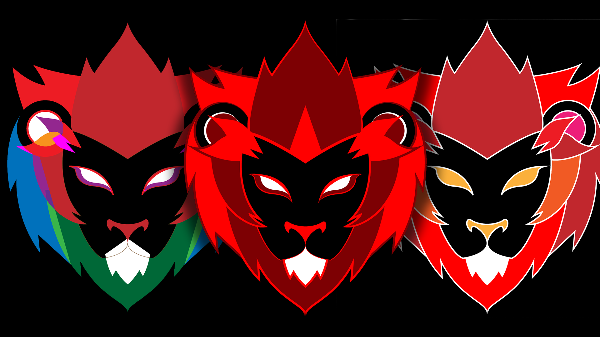
"SIMPLE LOGO OF MAJESTIC LION

INSPIRATION
For art direction, ImLionMane asked for a simple logo of a majestic looking lion, and gave me the series of images to the right and a color palette of red, black and white.

EXPLORATION
I drew lines. Began with a couple of 1 minute sketches and proceeded to 5 minute sketches. Once I felt I had some good ones I went and did a 30 minute color sketch. This allowed me to gather a better understanding of a lions’ shadows and highlights.


THE CHOSEN ONE - When I presented the drawings to ImLionMane, he was quick with his pick and chose the 1st sketch, the sketch above. Lucky me, it was one of the earlier sketches I did so I was glad to not have to go back to the drawing board.
WORKFLOW VIDEO
This video is a full-length time-lapse of the sketches above. You will see that there were other drawings that I did not feature. Also you will see how my hand loosened up with later sketches.

sketches to vectors
After bringing the drawing into Illustrator, I used the pen tool to create the outlines. The drawing is intended to be symmetrical so I outlined the left side of the drawing and proceeded to group, copy and mirror.
Below are several of the initial iterations with explanations of the process and visual queues.

ITERATION #1 - This was the first set of outlines from illustrator. I filled the shapes with analogous colors to red.
ITERATION #2 - I switched the outlines to the background color to see the relations between the shapes and their respective colors.

ITERATION #3 - Removed the outlines and changed the color of the ears to white. This made the logo appear flat.

ITERATION #4 - Attempted to keep the color palette closer to what the client requested. However I justified the red shade to provide some depth.

ITERATION #5 - With this one I flipped the two tones of reds with Iteration #4. Barely noticeable was the conclusion.

ITERATION #6 - Switched the colors of shapes around the mane to simplify the composition.
FREESTYLED THIS ONE
ITERATION # 7 - For this one I intended to break the mold and experiment with the colors and shapes. I converted the composition to Live Paint and proceeded to color the logo with primary color shades and tertiary highlights.
Also I explored ideas that I had with the eyes and executed them. The client was more than happy with the new scopes.
FINAL LOGO
